Head shots are no doubt the most common kind of portrait. I have shot hundreds of them, and while there is little creative challenge in terms of lighting, it’s always fun meeting new people, if only briefly.
And there’s always the challenge of capturing a good expression.
I shoot them the same way for a consistent look. Regardless of employee turnover, the photos will always appear like they were taken on the same day.
Head shots today are most commonly seen on the web, and are usually shown small. Images that work best online are:
- Brightly lit. You need shadows to define a face, but the ratio of lighting should be fairly close. Moody portraits don’t work well at 200 pixels on various computer screens with who-knows-what settings. Photographers and web designers know the awful feeling of seeing their work on crummy, uncalibrated monitors.
- Show eye contact. Eyes are magnetic. I always ask the subject to look right at the lens. When choosing an image, I put several on screen at once then step back six feet from the computer. Usually one or two will catch my eye. Those are the ones that will connect with the viewer on the website.
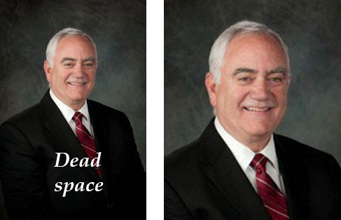
- Crop to show the face. That’s where the viewer will make the connection. I came across the image below yesterday as I was paying my property taxes. The Ventura County treasurer is shown on the county website at left. Notice how nearly half of the image is his dark suit. That contains no useful information. I took the same image and cropped it to favor the face — now that’s a guy who deserves to get my check.
